Before: "Frosting" on the walls was not such a sweet thing to look at. Ugly brown cabinets and beige/putty colored counter tops with a black and white tile bathroom just don't blend well.
When we bought our home nearly two years ago, the bathroom (to me) was the scariest room in the house. The walls made my stomach turn; they were plastered with some kind of plaster (thankfully water-soluble), and looked like someone had haphazardly smeared frosting everywhere to cover up some kind of nightmare underneath. But you learn to make do and be thankful for having a safe, warm place to live, and then work to make it more comfortable over time.
Everyone is helping out to get the job done.
One day as I was washing down the black and white tiles, I realized that the plaster "designs" on the walls came off easily with a wet washcloth. One day I took a wash cloth and wiped off an area on the wall. I made it heart shaped just for fun. Then I decided that little by little I'd wipe all the hideous frosting away, and we'd eventually have flat surfaces on which to paint with bathroom-grade paint.
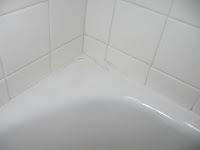
I also learned the secret to removing those nasty mildew stains in the corners of my tub: soaking them overnight with bleach-soaked rags makes it look like new with hardly any effort!
After photos above: No frosting on the ceiling or walls (though the paint job wasn't touched up by professionals). One happy homemaker showing off her muscles and maternal figure. Below: The red helps to blend the beige counter top and sink, and adds warmth and beauty. Now just what to do with all that white wall space?
Since this makeover was mostly cleaning and re-painting, we decided to paint the cabinets a spiced apple red. I figured this red would go with the beige counter as well as the black and white. I found a great idea in Better Homes and Gardens magazine about how to spruce up a plain white shower curtain, so I sewed up the floral valance to go with my new hotel-grade shower curtain and liner, and I love how it all ties together. Now we just need to know what to do with all that wall space...
With results like this, I consider it one of my favorite rooms in the house now. Now that's what I call domestic victory!


I always hate painting over perfectly nice wood, but that spicy red was definitely a good choice! Great job!
ReplyDeleteWhere's that new niece? :)
Unless you name him Antoin(e) ??
Hugs!
I love the red cabinets! I want to spruce my my guest bathroom and re-paint the girls' bathroom. I think I'm going to make it a project for Dad when he and Mom are here in November! I'm thinking white bead-board with a chair railing and a pale pink/rose paint... We'll see. I can't wait to hear the baby news!!!
ReplyDelete